Sale on canvas prints! Use code ABCXYZ at checkout for a special discount!

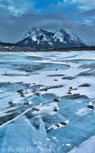
Sometimes I’ll approach a scene and have a very clear idea that I’m going to develop the image as a monochrome treatment, or that I will stay with color. Sometimes both work. In this case, I initially planned this shot as a monochrome right from the beginning. The way the light was playing over the scene, the contrasts, and the details of ice, rocks, trees and clouds… it all seemed like it was going to be tailor-made for a nice, contrasty black & white image.
So that’s exactly how I set out to develop it. But once I went there, I found it wasn’t working for me at all. Even though the original scene was already quite monochromatic in a blue tone, I realized the blue coloration actually was a signature element that was needed to make the image come together. Without it, the frigid, crystalline qualities of the scene just weren’t being communicated. Having that icy pale blue in place really helps sell the winterness of being out on a frozen lake.
Now, I’ll often find that a scene I’m taking to monochrome has a signature color to it in a small area with a key subject element. In that case I’ll still go to black & white, but with some selective tinting with that original color to act as a kind of visual grace note. In this case the cold blue was essentially pervasive, so my final conclusion was to reset my plans and go back to a full color rendition. Stylistic plans are all well & good, but it’s important for the image to work on its own terms.